I’m a designer with deep experience in building brands, websites, and digital products. My background spans in the intersection of product, growth, and AI, with work across a fintech company, a major news media organization, and even contributing to the website for the Rio 2016 Olympics. More info.
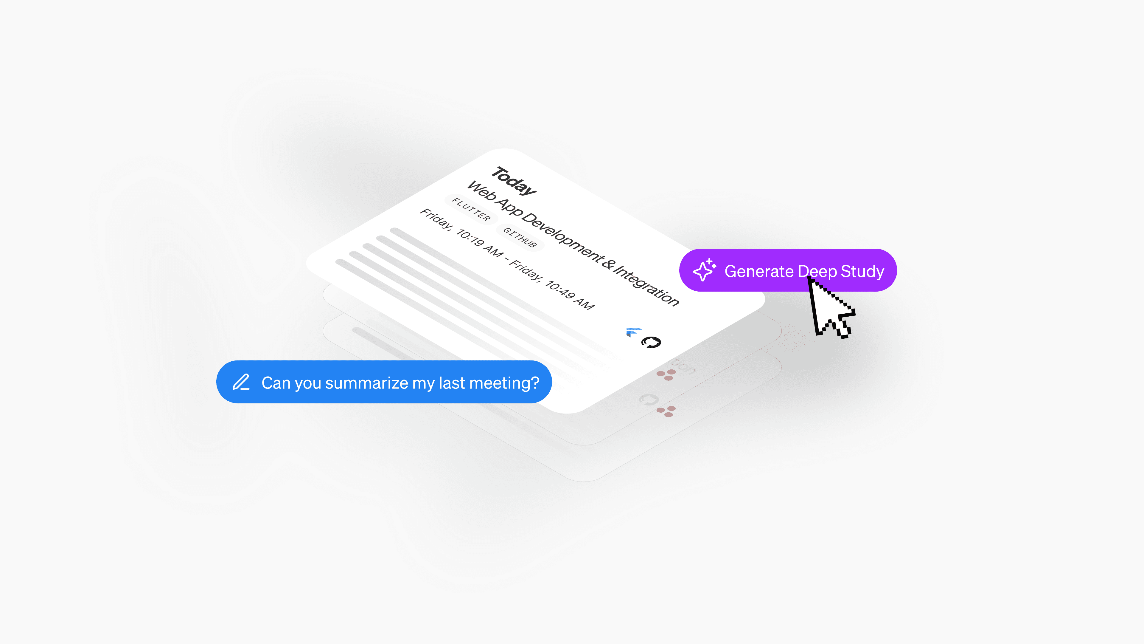
Developers bounce between tabs, terminals, meetings, and repos. When they return to a task – even hours later – they spend precious time reconstructing context. This project had the goal to turn any activity into a clear, trustworthy summary with next steps and resurface it at the right moments so devs can pick up work in seconds, not minutes.

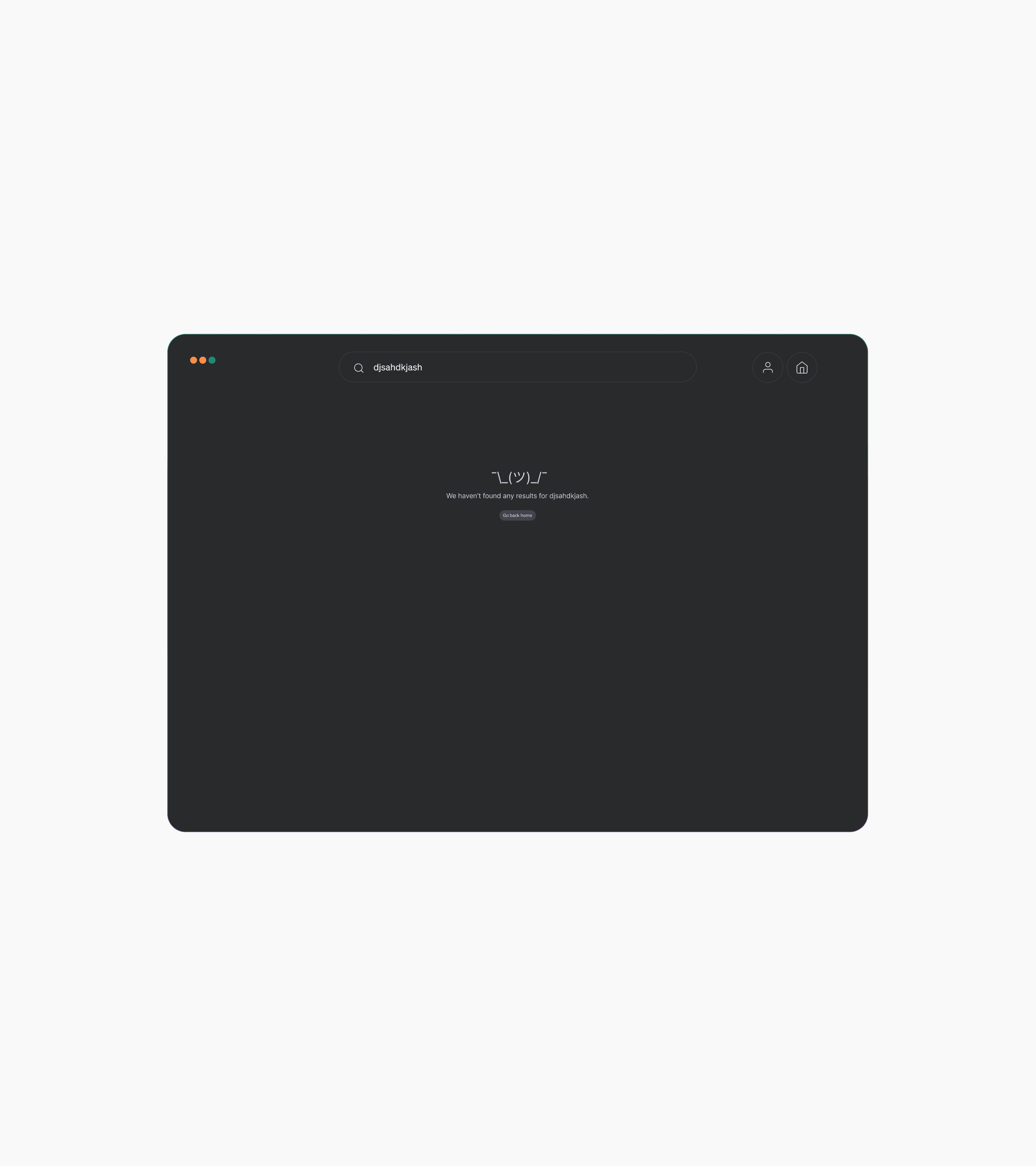
Pieces had two distinct search functionalities—Saved Materials Search and Global Search—each serving different purposes but ultimately creating friction and confusion for users. As adoption grew and our users’ workflows became more sophisticated, it became clear that this bifurcated experience was holding us back from delivering the clarity and utility developers needed.
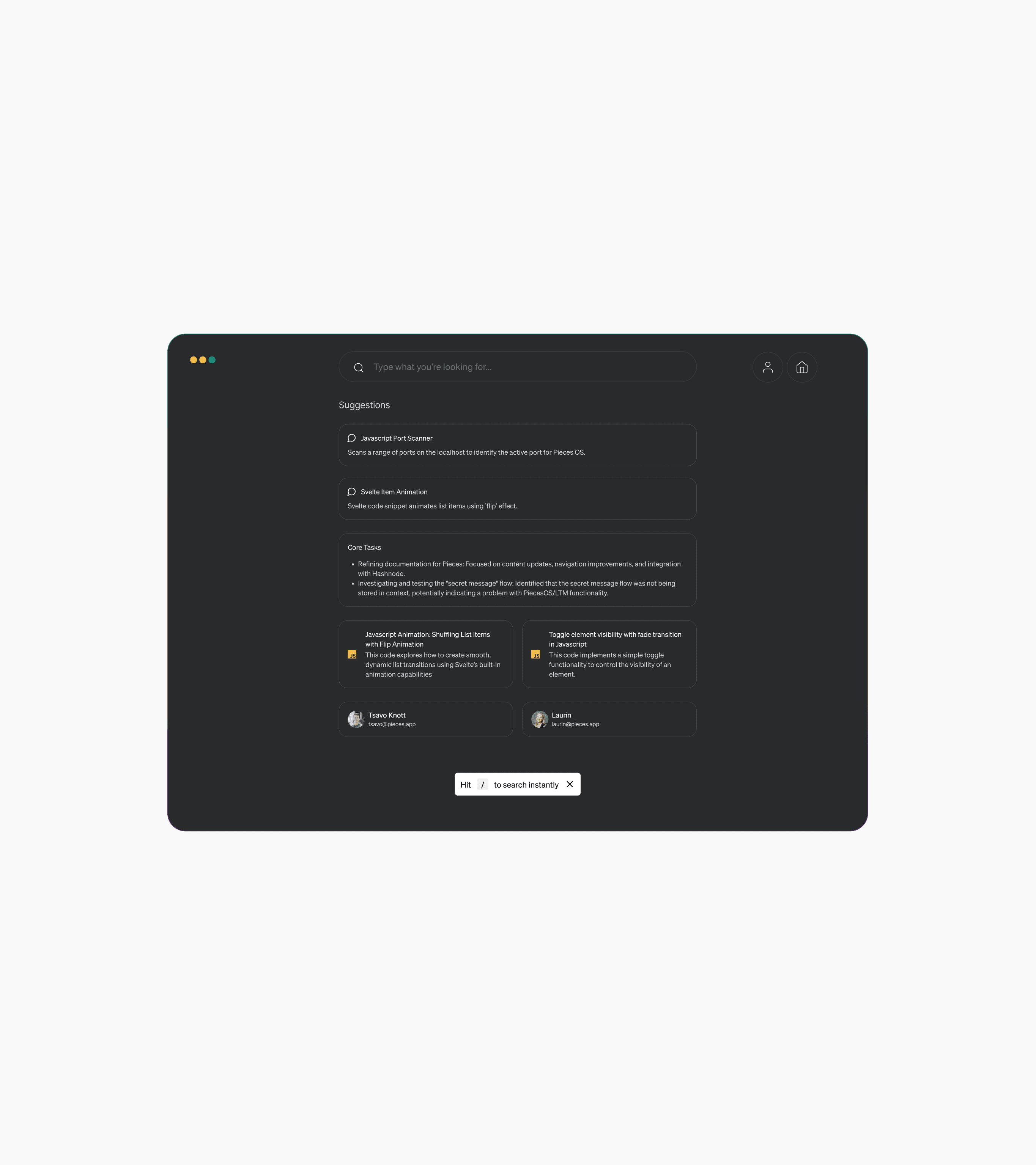
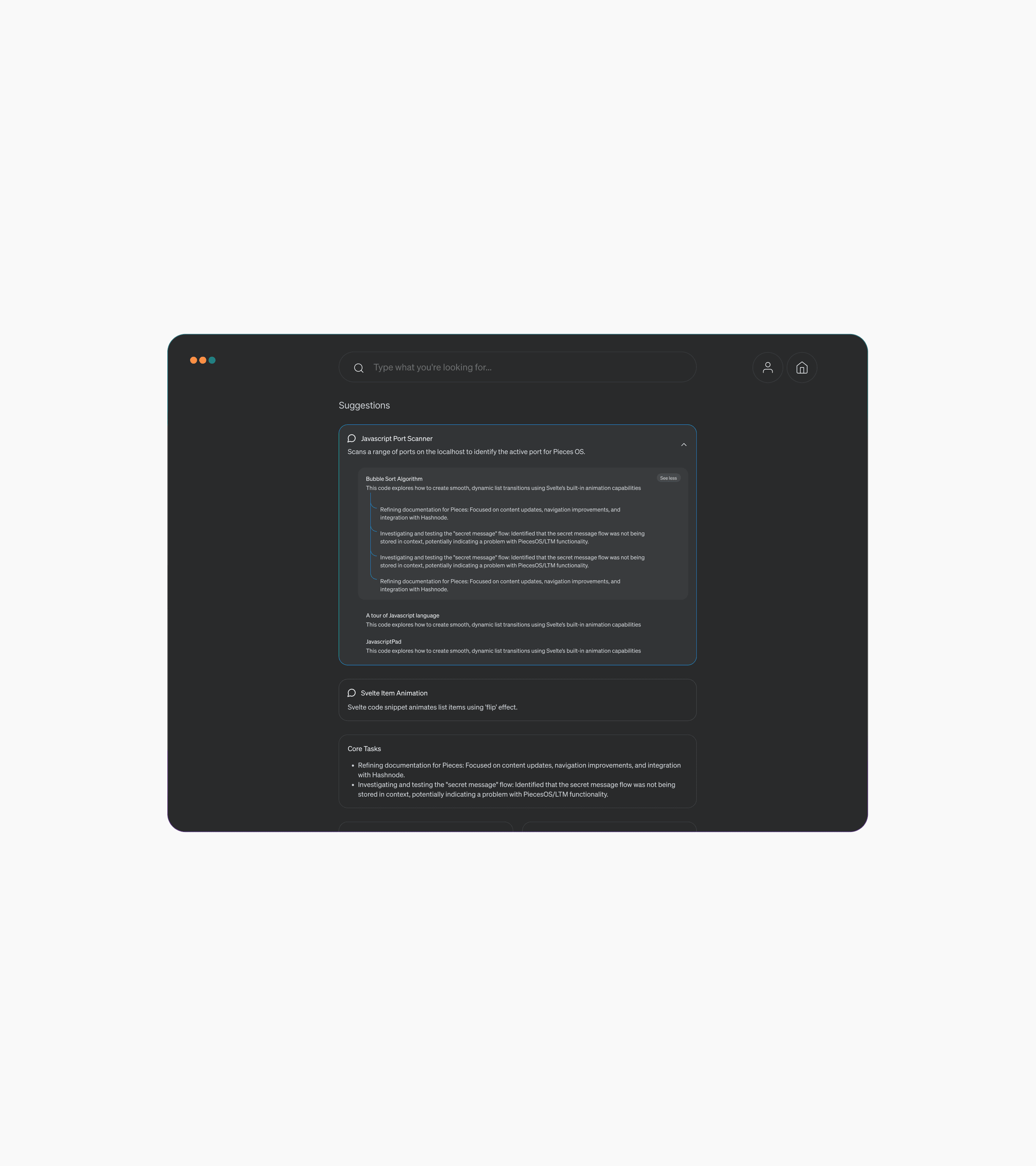
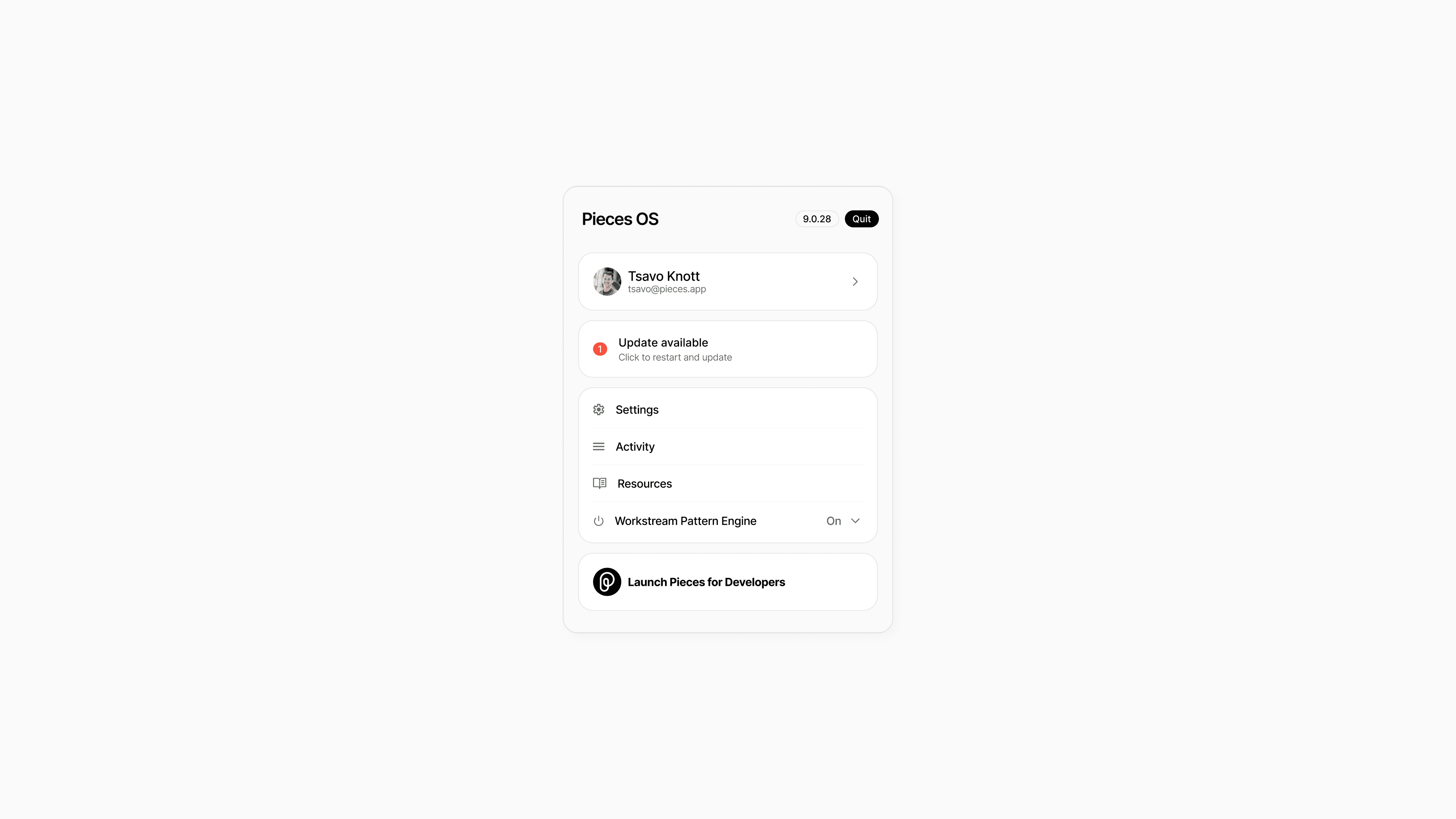
Pieces OS is the brain of Pieces for Developers. It makes sure all developers' tools work together intelligently and efficiently and operates as a background service that functions both offline and on-device to facilitate communication among individual products within the Pieces for Developers Suite.
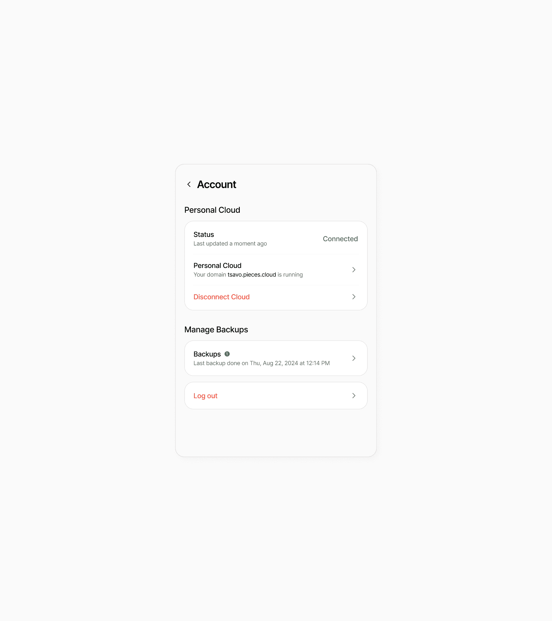
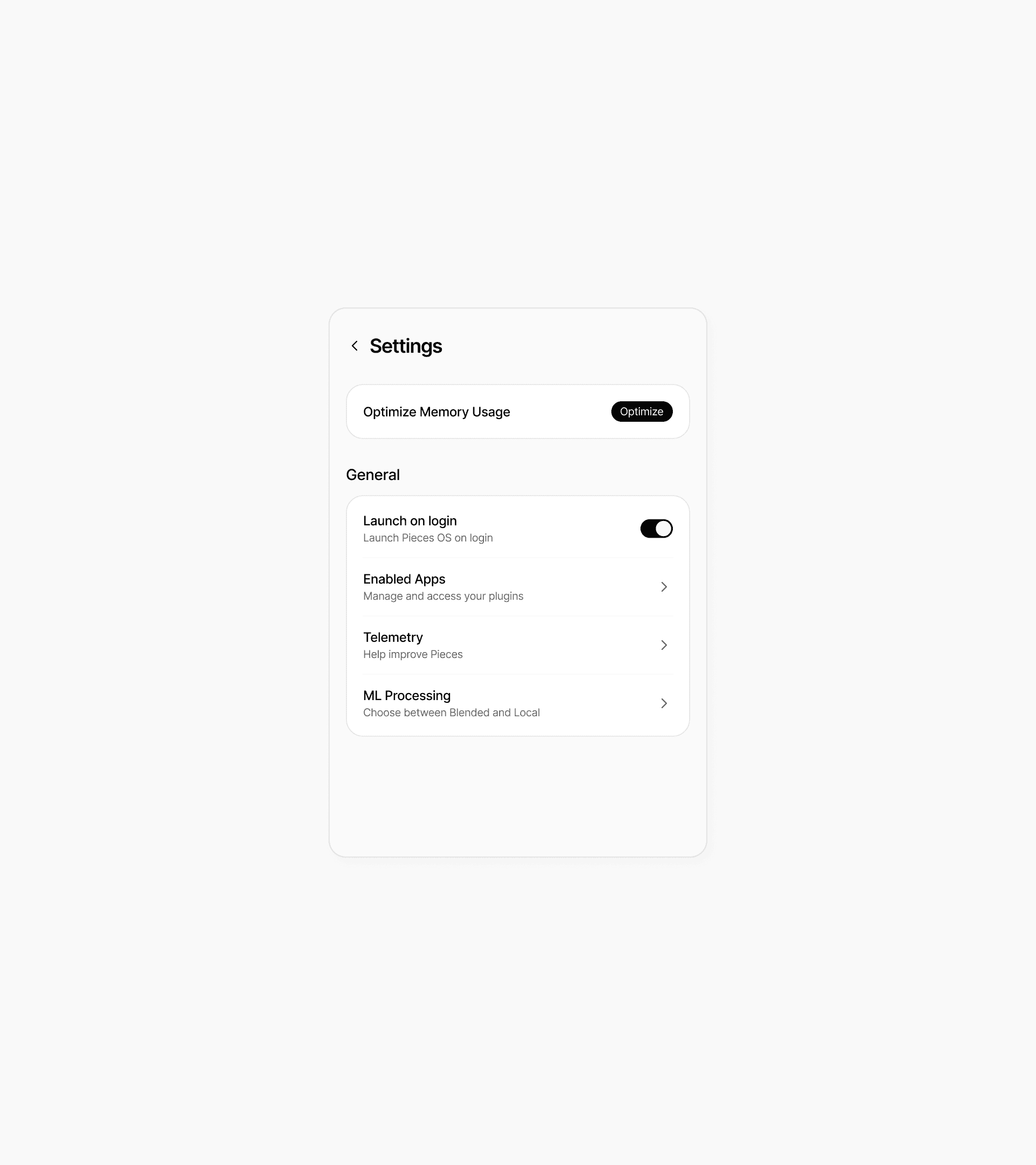
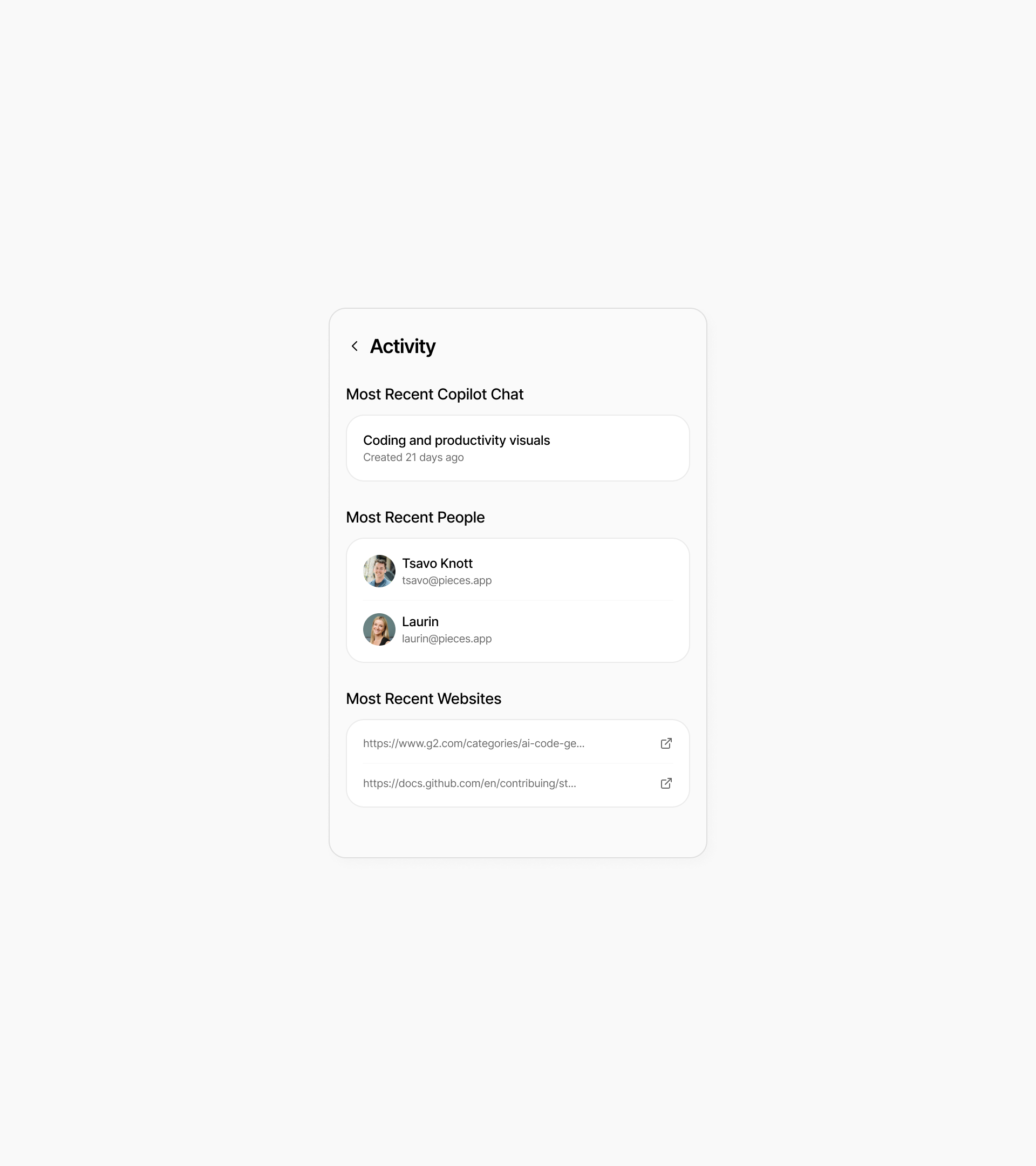
Pieces OS hadn’t seen a redesign in nearly four years. Without UX designers in the past, developers kept adding features and options to meet users’ needs, but there wasn’t much strategy or thought behind it. This led to a lack of information architecture, visual guidance, and hierarchy. As the company evolves and continues adding new features, we felt it was time to create a solid foundation for the future and bring a fresh, modern approach.
The redesign transformed Pieces OS from a product that simply “got the job done” into one that users truly enjoy interacting with. It’s now a platform that feels thoughtful, intuitive, and ready to grow with its audience.
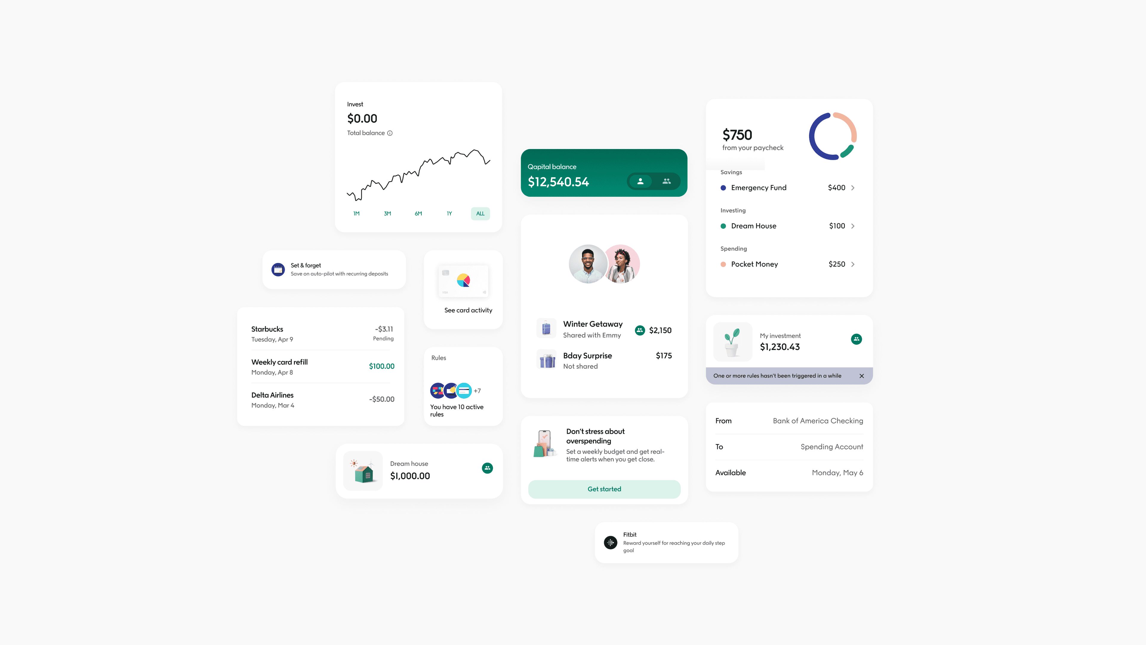
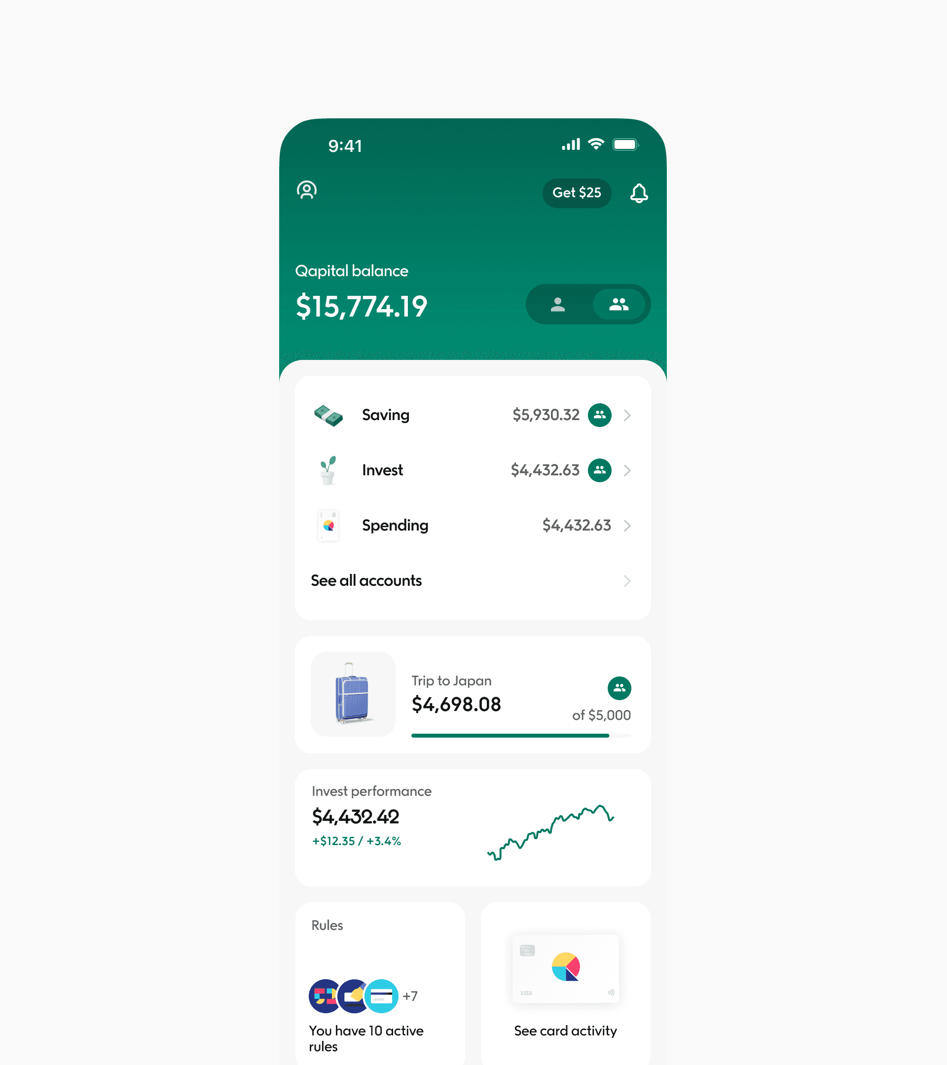
Qapital has always been more than just a savings app. With the redesign, we’ve made it easier to explore the app, discover other features, and build a personalized money management system that works for people.
1,690
New accounts opened as of November, 2024. The redesign drove significant user acquisition post-launch.
72%
Conversion rate in funded accounts directly linked to our streamlined onboarding.
$891K AUM
Enhancing trust and usability led to a increase in user investments of $891k total assets under management.
400+ ACH
Transactions in a day. Our work in improving performance made our transactions double.
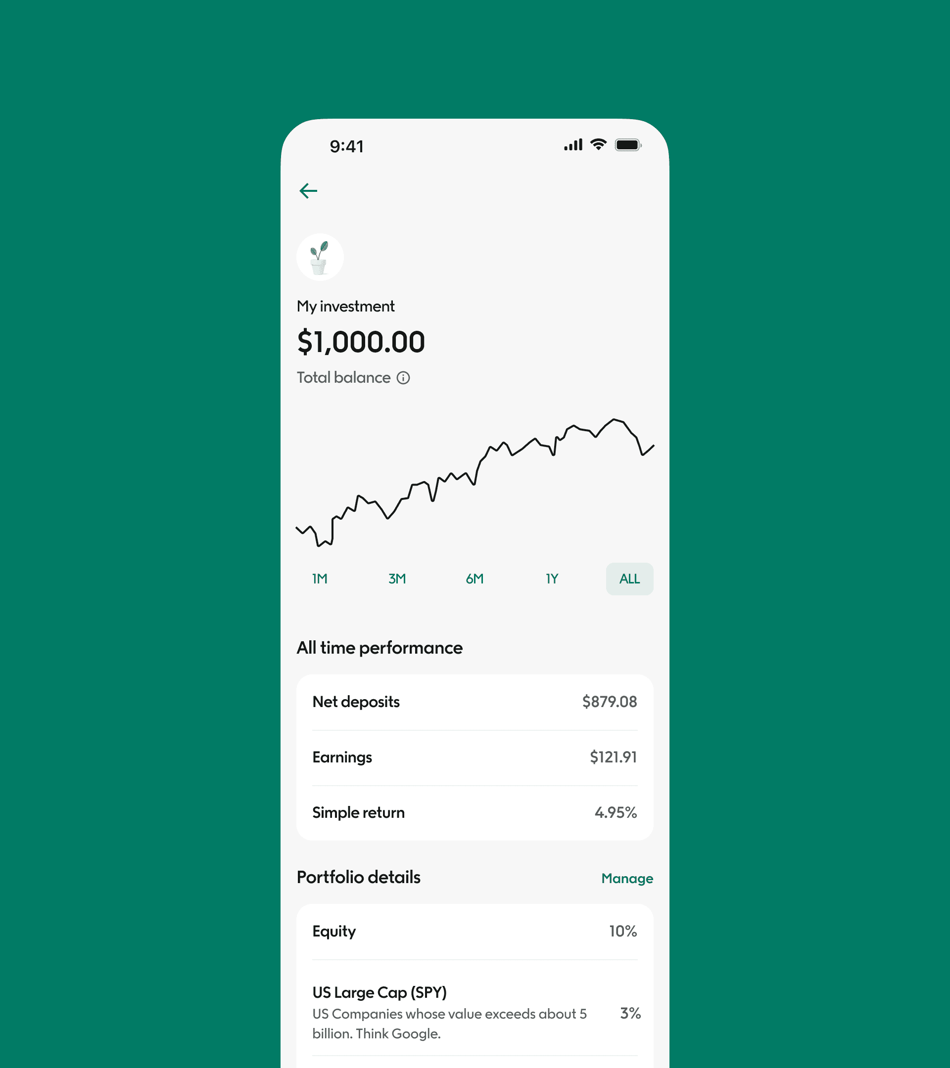
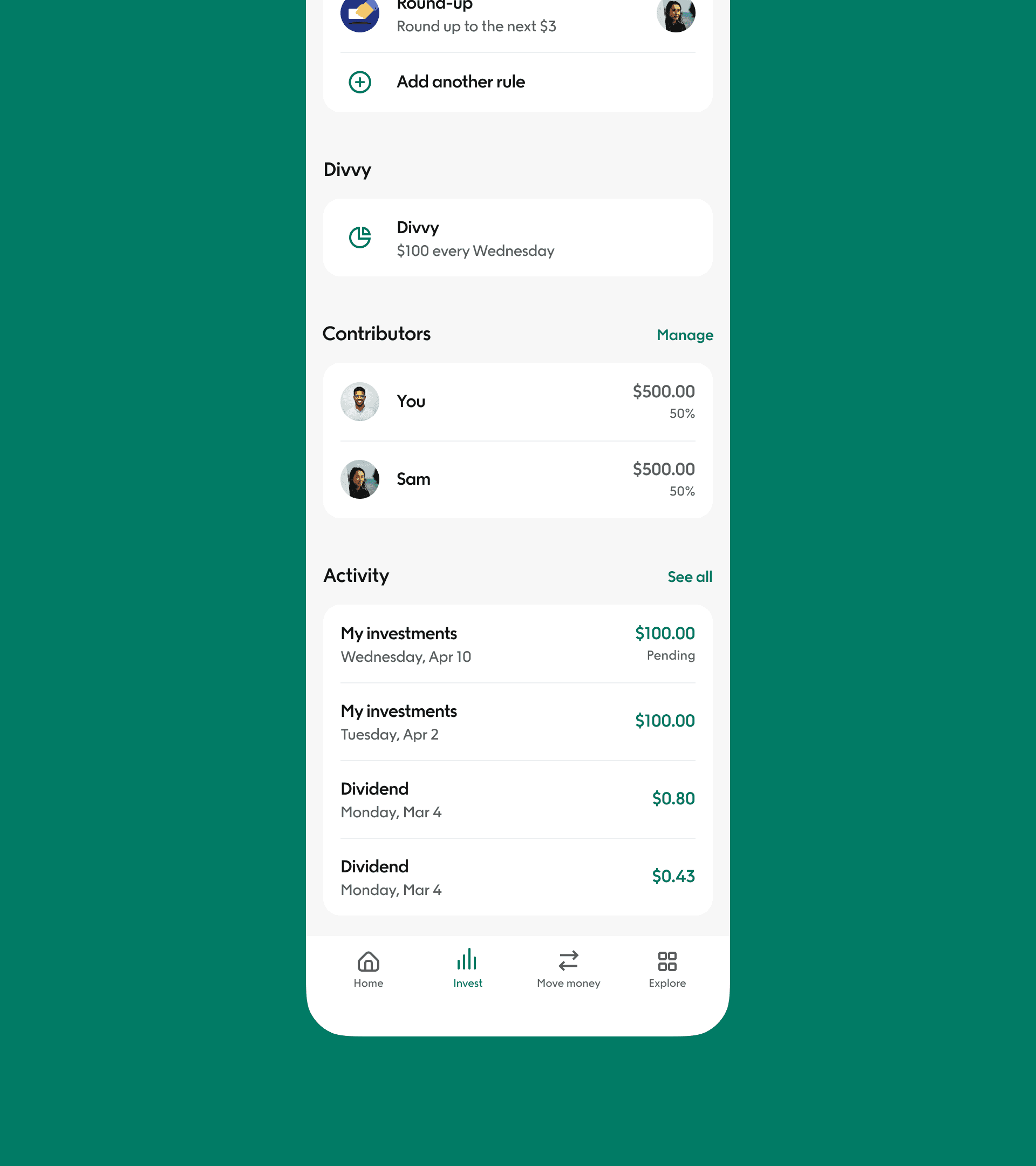
The new design enhanced user engagement, streamlined workflows, and built trust, empowering users to easily manage their investments while supporting the app’s scalability and performance. This marked the end of my era at Qapital.
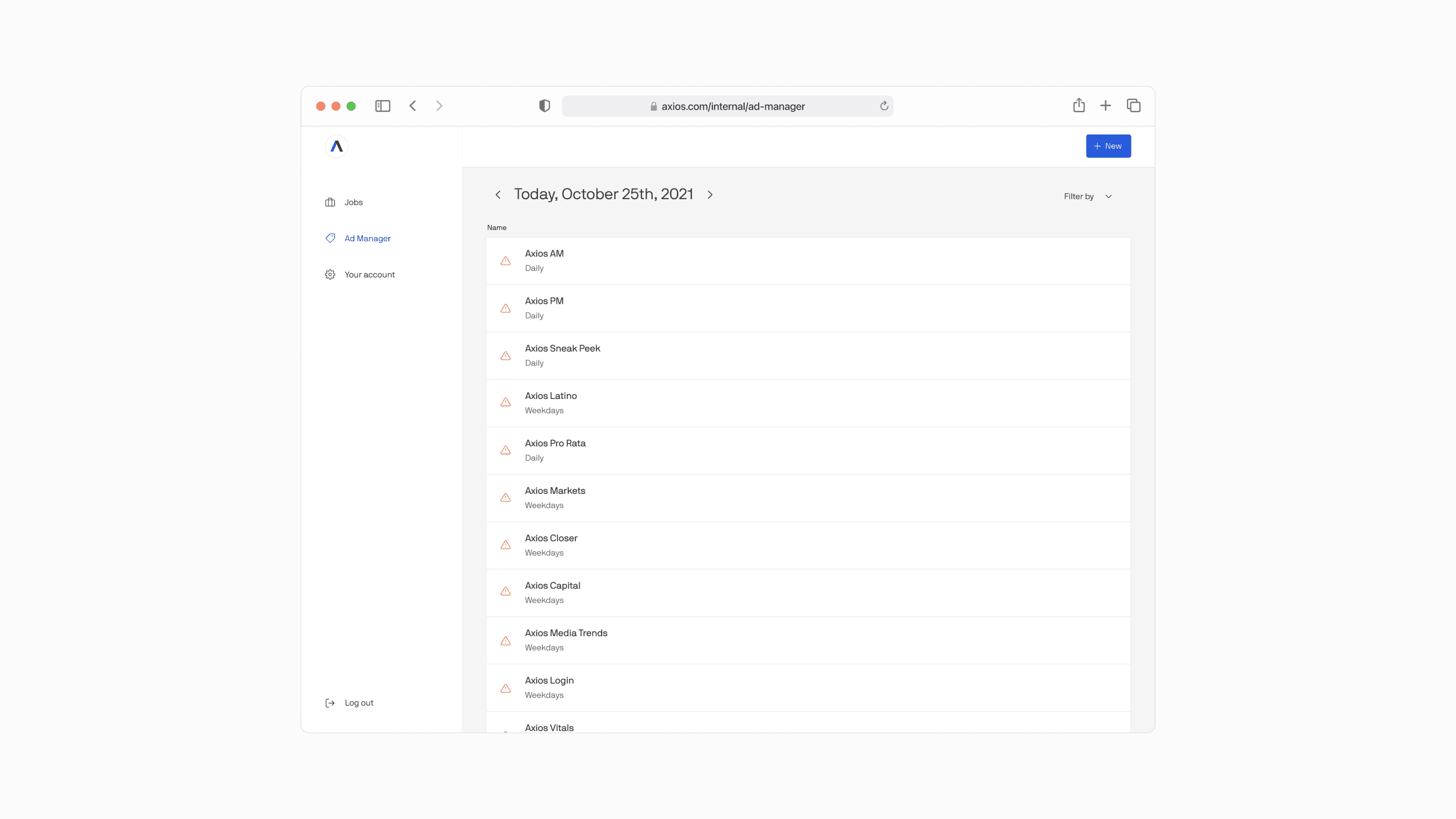
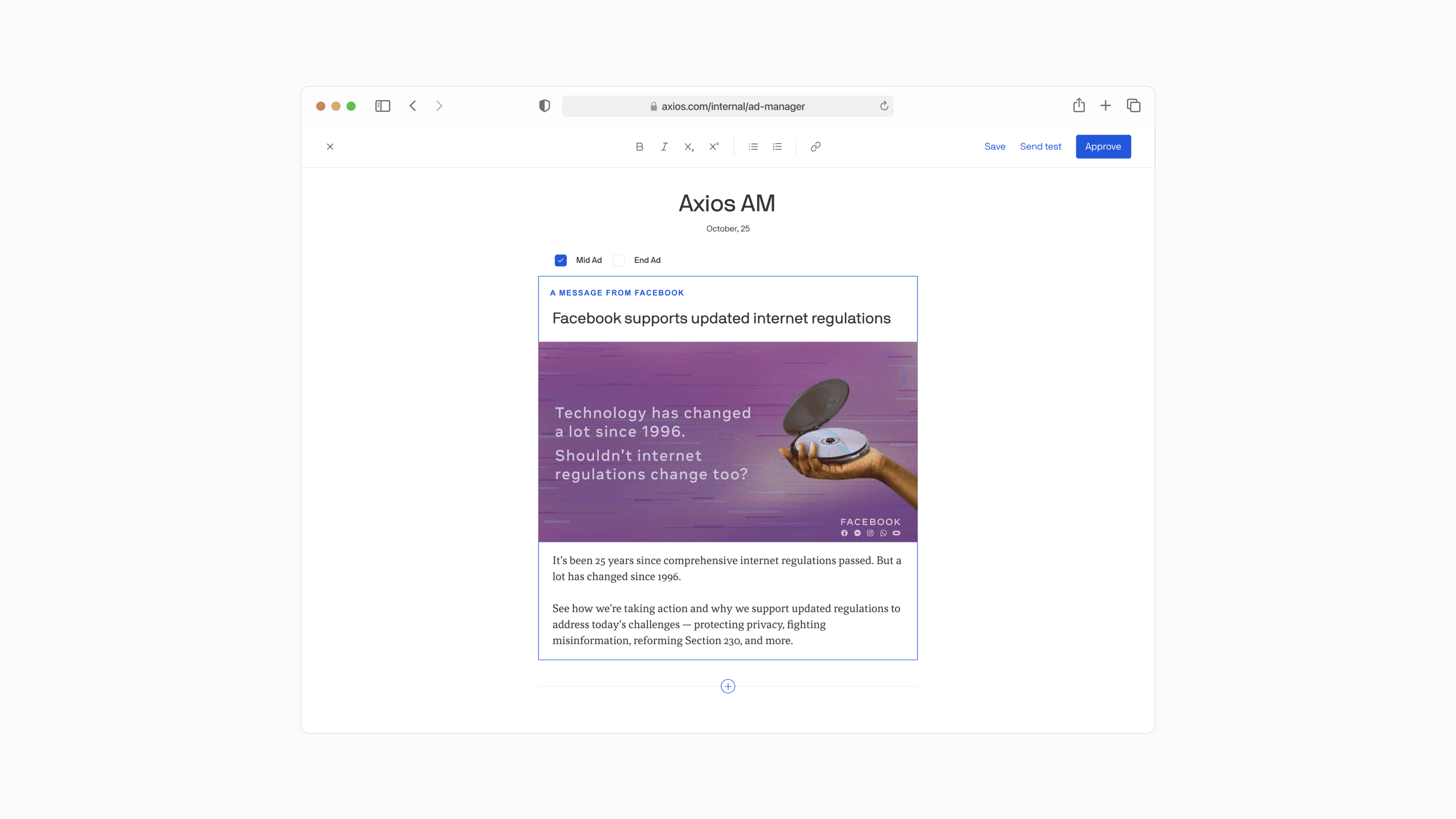
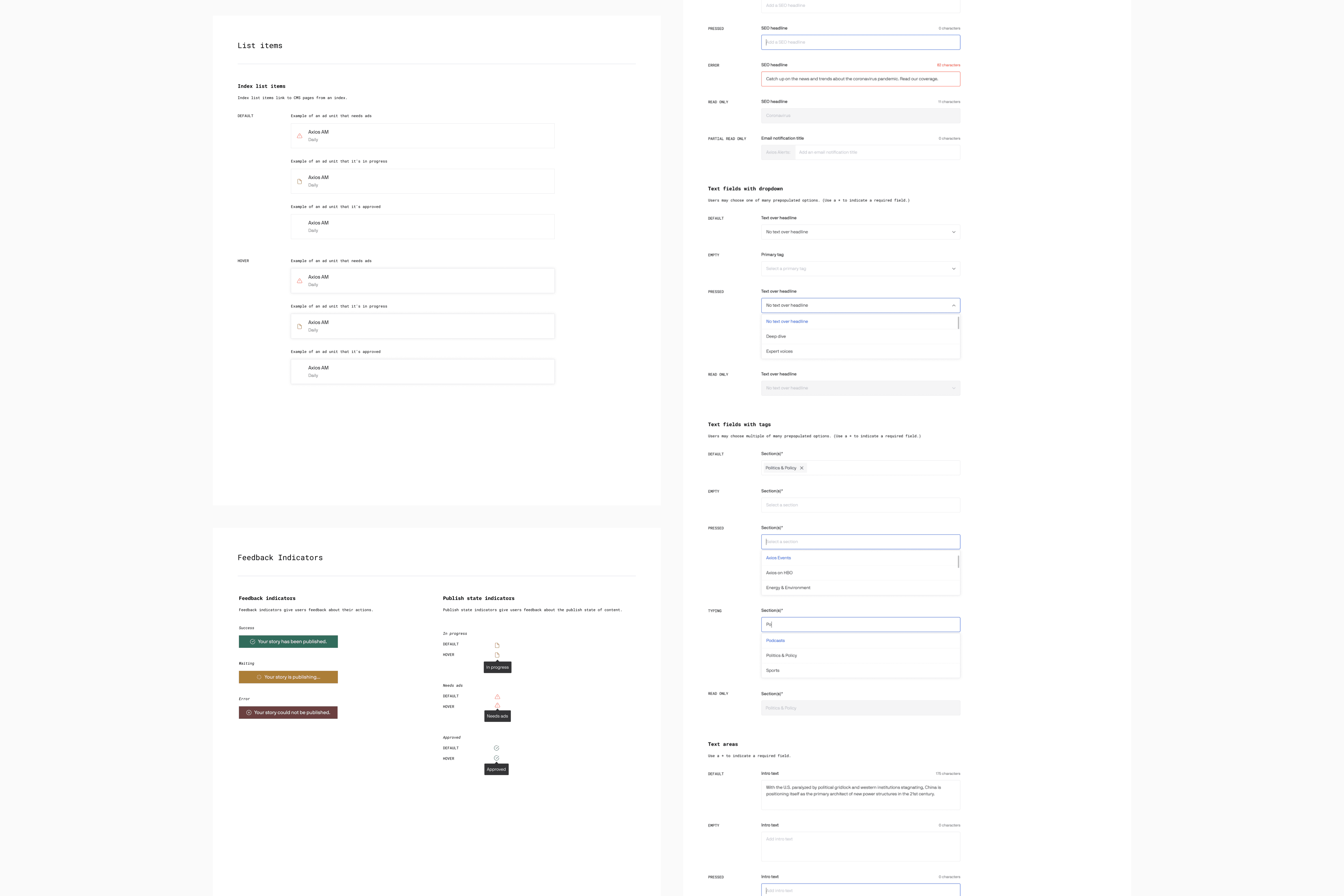
As Axios increased their newsletter portfolio, it was crucial to create a less manual and more streamlined way to place and schedule ad creatives as well as quality assure them. The Ad Ops and CS teams used Google Analytics in order to set-up all Newsletter ads. The workflow by which Ad Ops traffics ads to email newsletters was unsustainable and unscalable.
25% reduction
In overall time spent trafficking and testing newsletter ads.
Weekend work
eliminated for the AdOps team which was a big win for everyone.
Reduced risk
of AdOps capacity being a blocker to new newsletters.
Enhanced scalability
by establishing a robust foundation, enabling seamless support for future newsletter expansion.
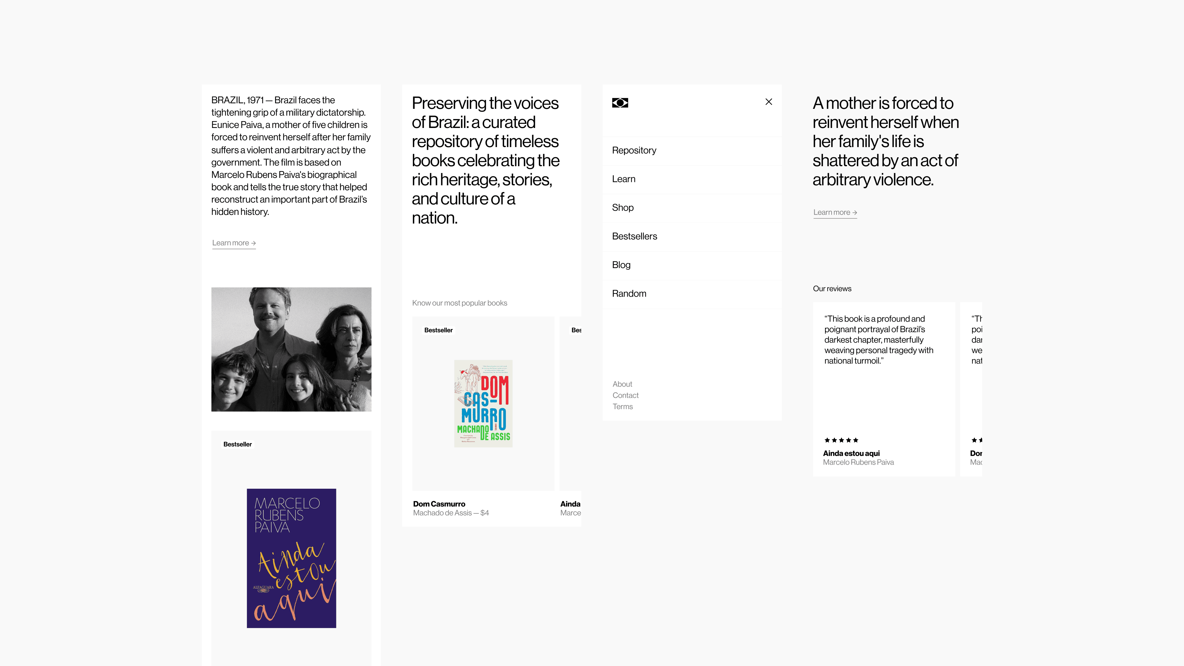
TECA is a dedicated repository celebrating the timeless beauty of Brazilian literature. Our mission is to curate, preserve, and share the rich tapestry of stories that define Brazil’s cultural and literary heritage.
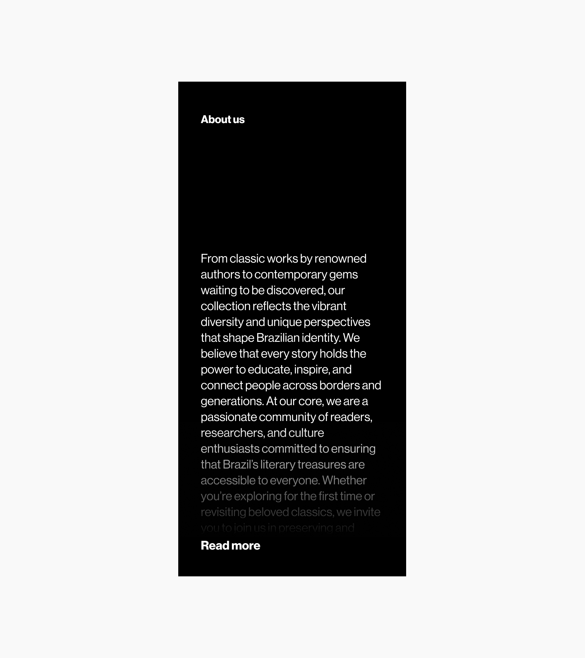
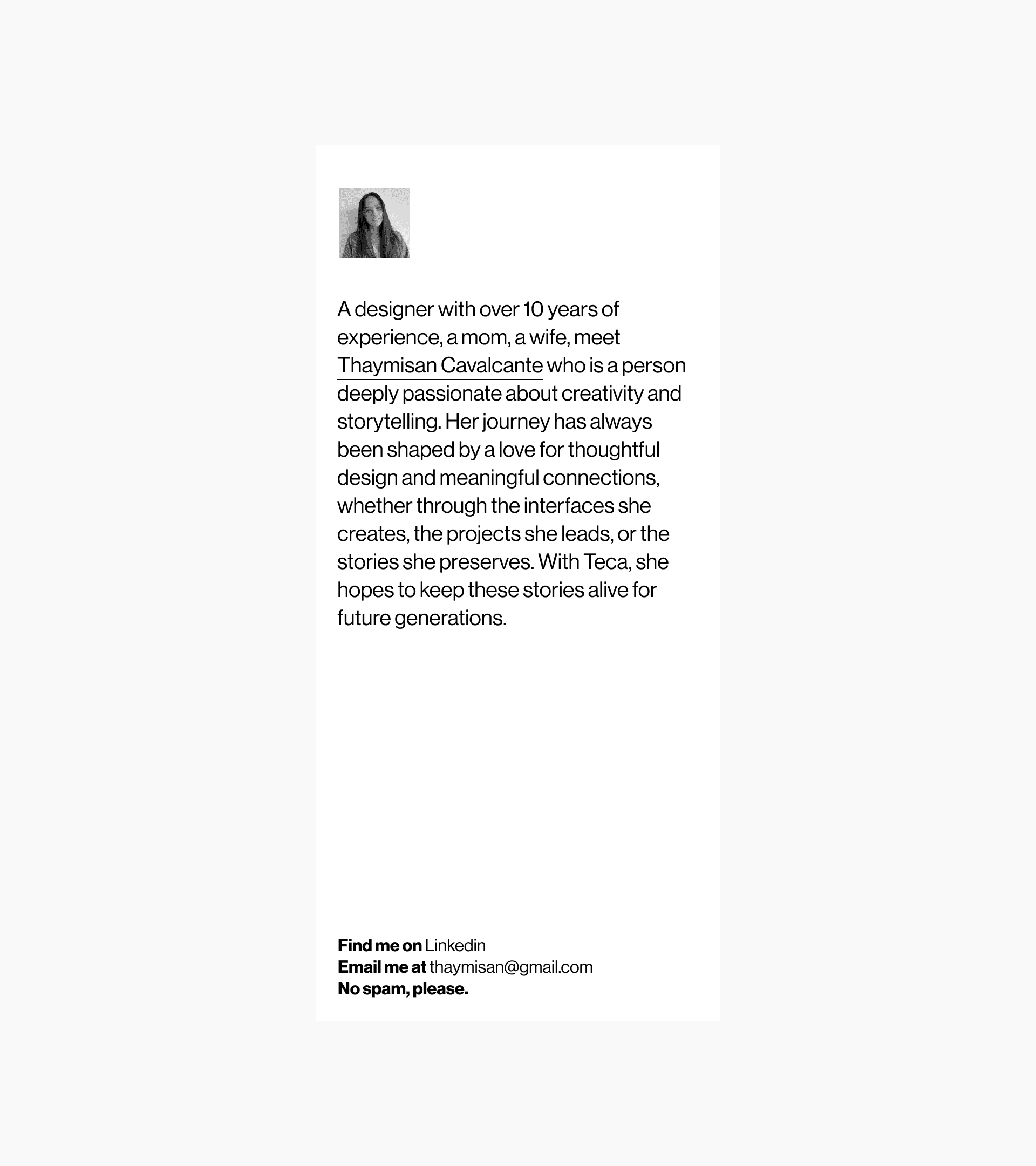
From timeless classics by renowned authors to contemporary gems yet to be discovered, this collection is a tribute to the vibrant diversity and unique perspectives that define Brazilian identity. I believe that every story has the power to educate, inspire, and forge connections that transcend borders and generations.
As I build this project, I’m diving into new tools and technologies—learning React, Next.js, and Framer Motion—to create a dynamic and immersive experience that honors these stories.
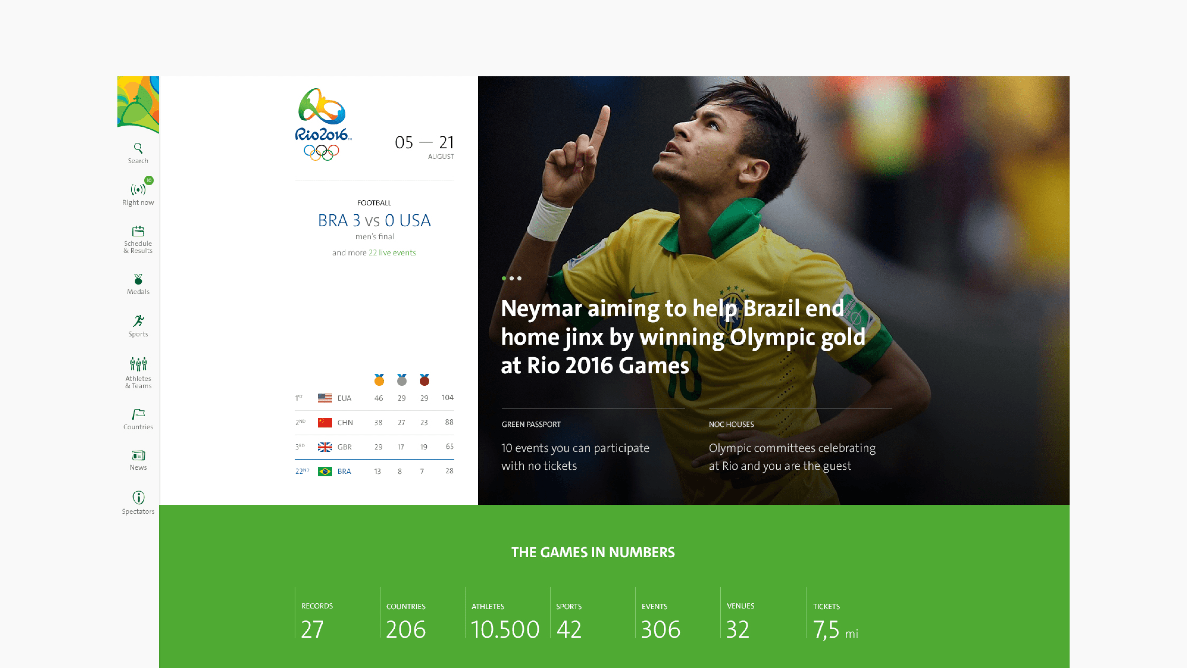
Building the official website for the most anticipated event in Brazil, the team was responsible for making sure it was an accessible and an easy-to-use platform.


I was mainly involved in the web design of the official Rio Olympics 2016 website, focusing on both desktop and mobile interactions.